
")
Detty December
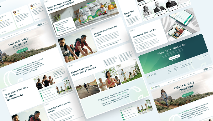
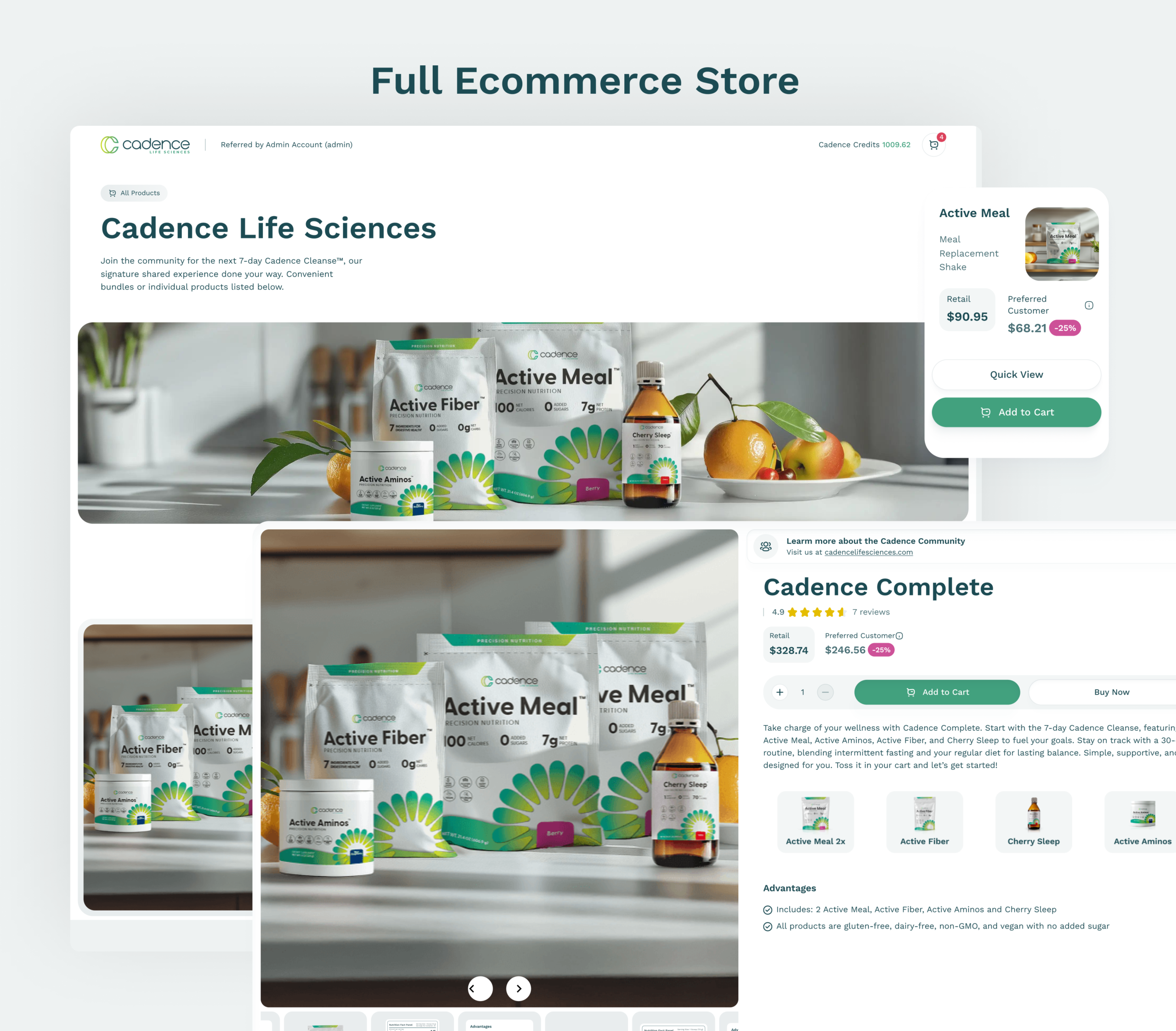
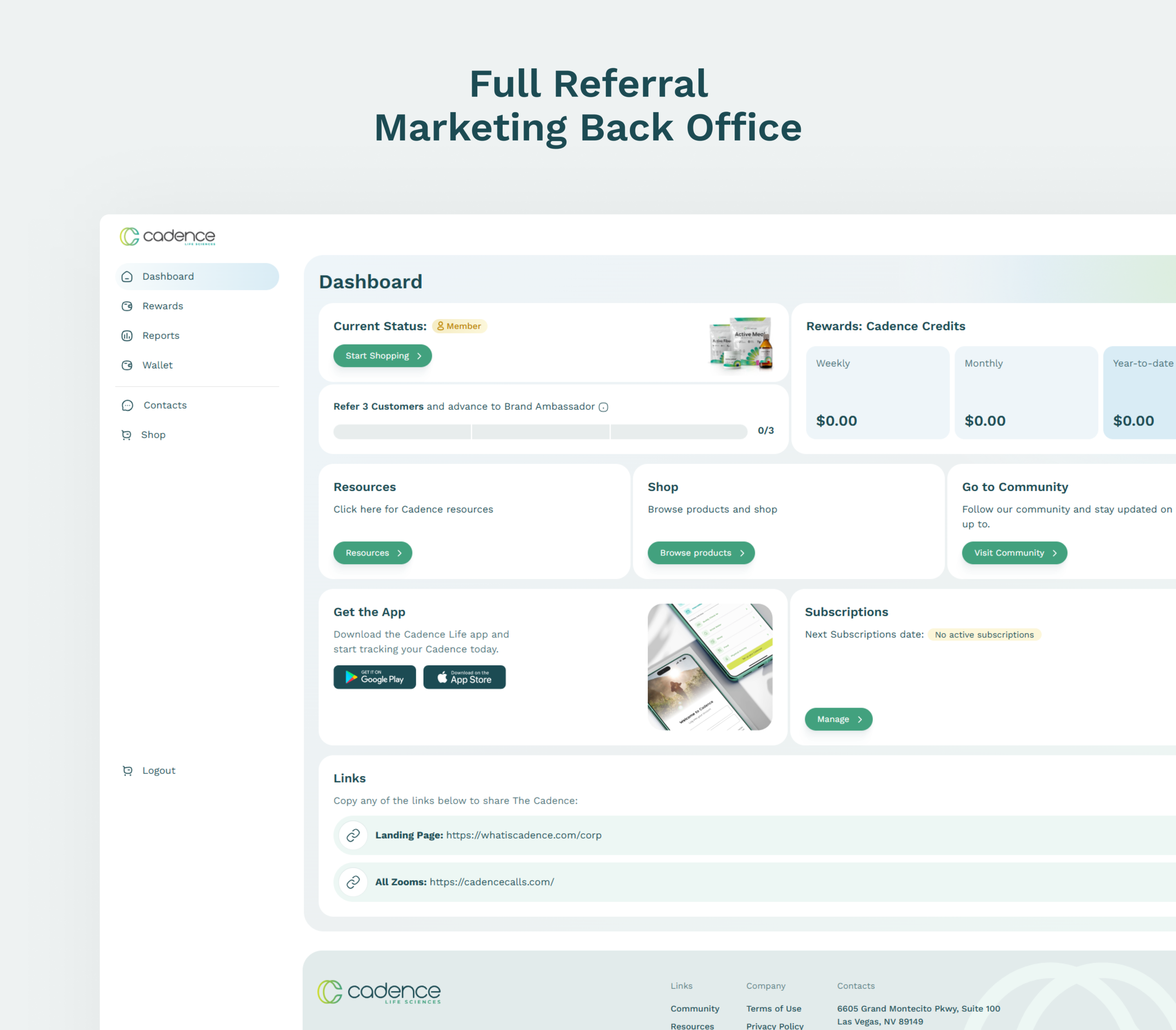
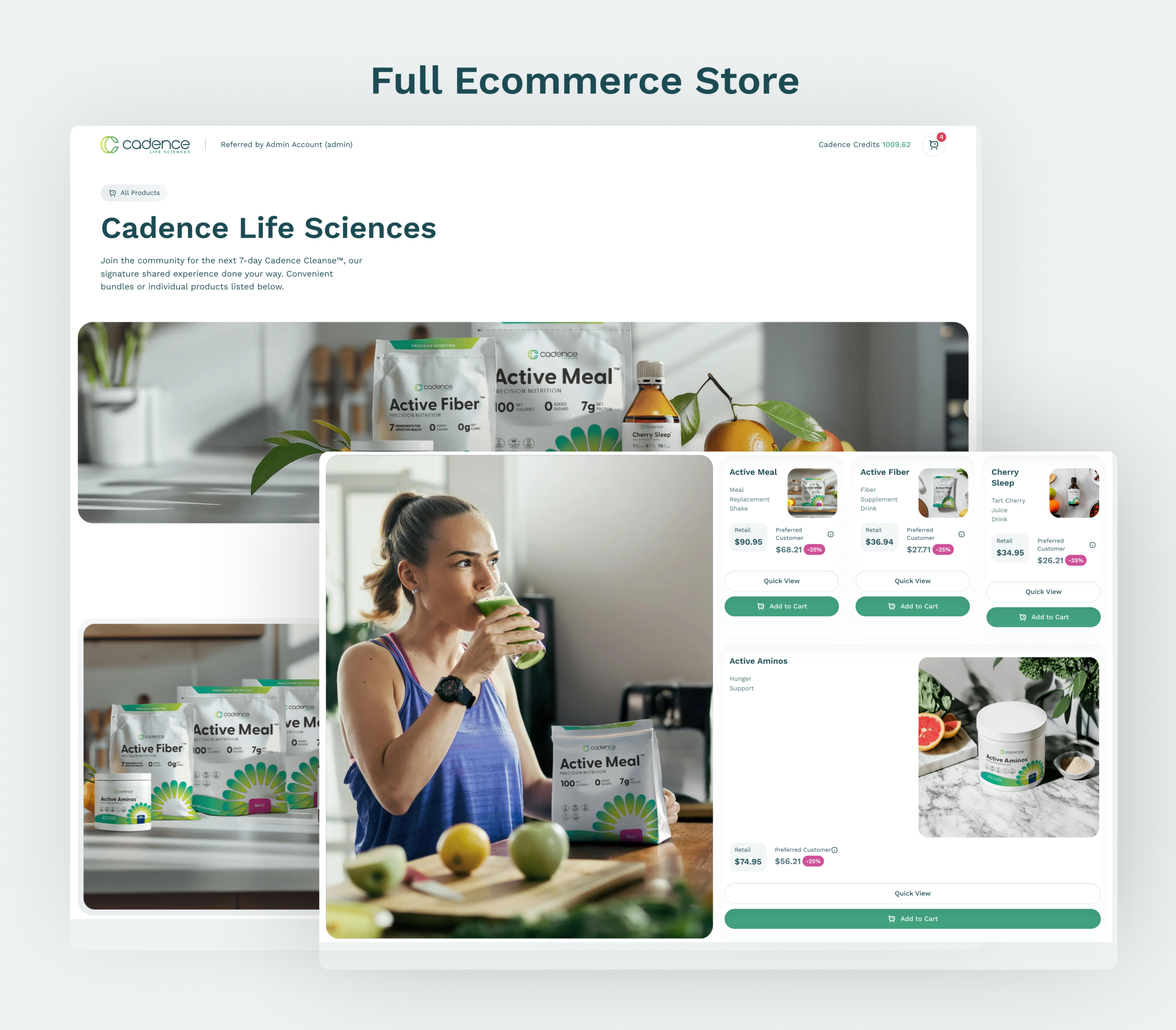
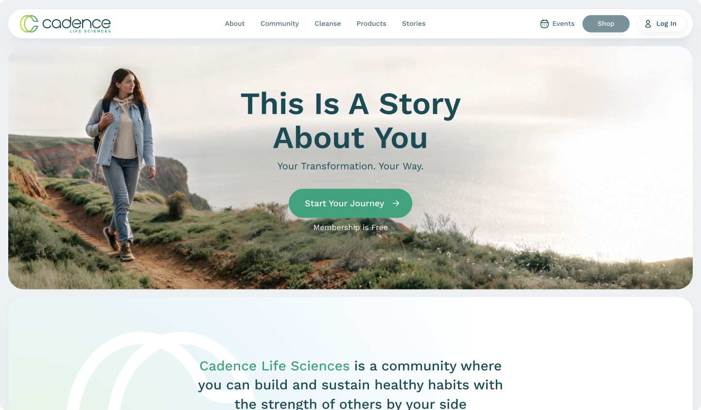
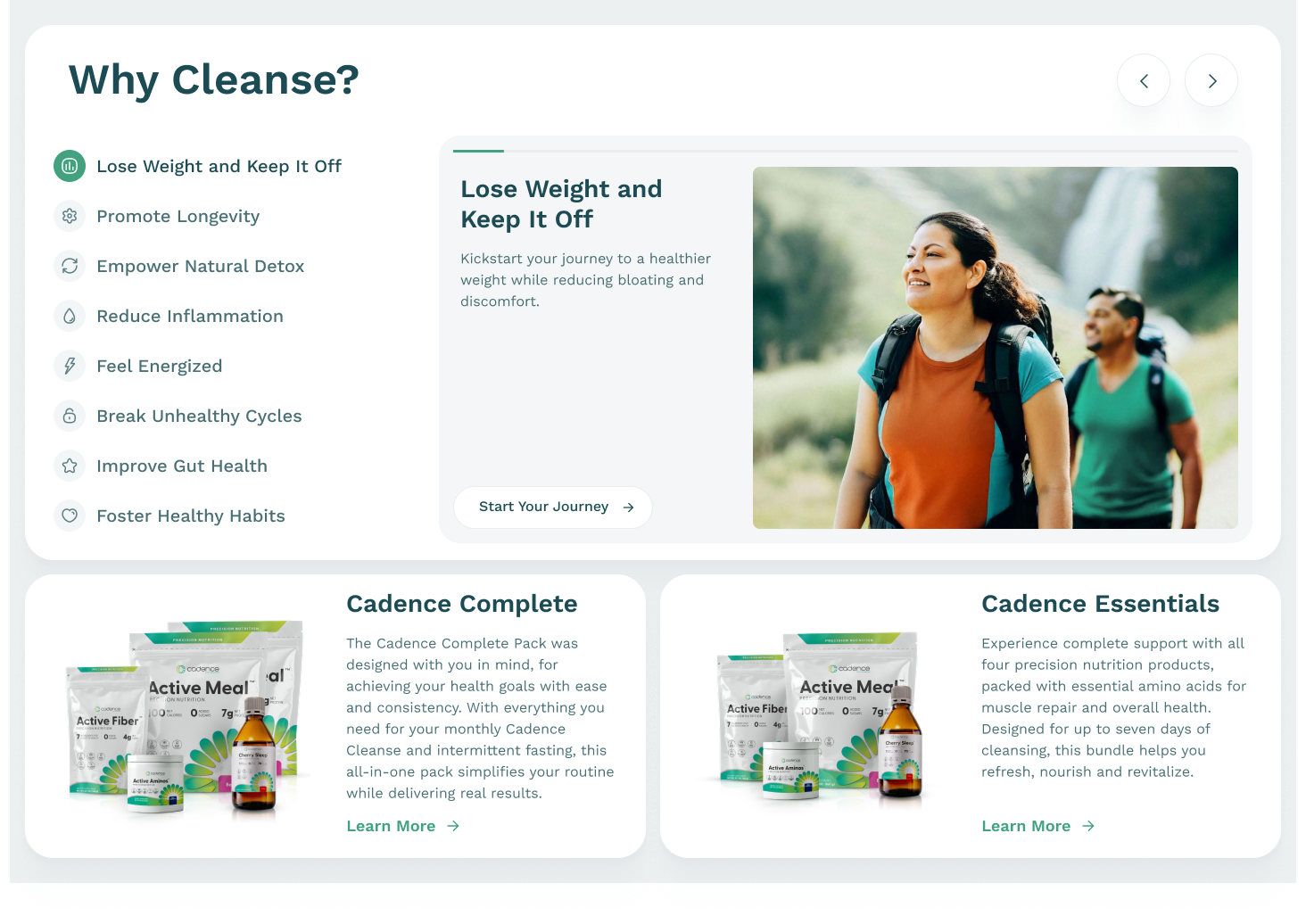
Cadence Life Sciences is a community where you can build and sustain healthy habits with the strength of others by your side
Namelessshop
Cadence Life Sciences is a community where you can build and sustain healthy habits with the strength of others by your side

Elevating Visual Narratives
We don’t follow trends—we spark them. Bold ideas lead to brave results, and we’re here to pioneer what’s next.

Telling Stories That Matter
Ideas know no limits—and neither do we. From culture to code, visuals to voice, we create without borders to deliver work that transcends expectations and…
")
From Concept to Impact
We turn bold ideas into real-world impact. Every frame, every message is designed to move people—and brands—forward.

The Art of Digital Storytelling
A brand is more than a logo. We breathe life into identities, shaping emotions, movements, and lasting impressions.

Bringing Brands to Life
A brand is more than a logo. We breathe life into identities, shaping emotions, movements, and lasting impressions.

Redefining Creativity
Creativity isn’t a destination—it’s a rhythm, a pulse. We blur boundaries to discover fresh perspectives and unexpected beauty.

From Insight to Inspiration
We don’t follow trends—we spark them. Bold ideas lead to brave results, and we’re here to pioneer what’s next.

Empowering Brands Through
Visuals speak louder than words. We design striking imagery that empowers brands to stand out, connect, and inspire.

Marketing with Emotion
We don’t just market—we make people feel. By tapping into human emotion, we craft campaigns that resonate deeply and build lasting connections between brands and…

Nameless full casestudy
Ideas know no limits—and neither do we. From culture to code, visuals to voice, we create without borders to deliver work that transcends expectations and…